Designing Wargaming Trading Cards
It was a bright and sunshiny summer day when I nearly killed my grandmother and her best friend. Golden sunshine warmed my face through the back passenger window of a 1992 Oldsmobile Cutlass. While my grandmother drove us around I greedily tore into a booster pack of Pokemon cards, rifling through their images searching for that coveted rare star. And there he was. His poorly drawn, ill-shapen form staring back at me.
I let out a shriek that caused both my grandmother and her friend to take their eyes off the road and look back at me. Luckily I didn’t cause us to go careening off of the road that day, but I’ll never forget how I came to own my original Charizard card.
Since the 90’s Pokemon hysteria I’ve played three additional trading card games: Yugioh, Wizards of the Coast’s Magic the Gathering, and their Star Wars Trading Card Game. I absolutely loved the Starwars game, spending countless hours perfecting my Rebel deck featuring many versions of Luke Skywalker.
To me trading cards are awesome because of how they trick my brain. Acquiring a card which I covet can elicit the same feelings of owning something well engineered, rare and fun without actually existing beyond the paper they’re printed on. Like getting a new piece of tech or fancy garment, but it’s just a stupid piece of cardboard.
Searching around for resources on how to design my own trading card template lead me to this Clayton Barton video from 9 years ago. It was by far the best resource I could find on the topic. Along with the Charizard card above, these two cards below were my layout inspiration.
My goal was to create a template to slot all of my 6mm minis into for a custom deckbuilding-wargame which can only be played with my specific collection of miniatures.
The first version of the template was created exactly one year ago.
First Version
One of the problems with the first version was the small size of the numbers on the top right, as they are important for gameplay. It was also near impossible to identify the symbol associated with each of them indicating Cost, Control and Move.
I also attempted to make an illustrated version of the photograph, which was a fun learning experience, but was not tenable for each card.
Third Version
In the third iteration of the card I tried a bandaid solution of just increasing the size of the numbers while keeping them in the same cramped corner. It barely made a difference! Luckily I have a graphic design friend who I could bounce ideas off of and received lots of free feedback which was invaluable; ultimately the only reason I made any progress at all.
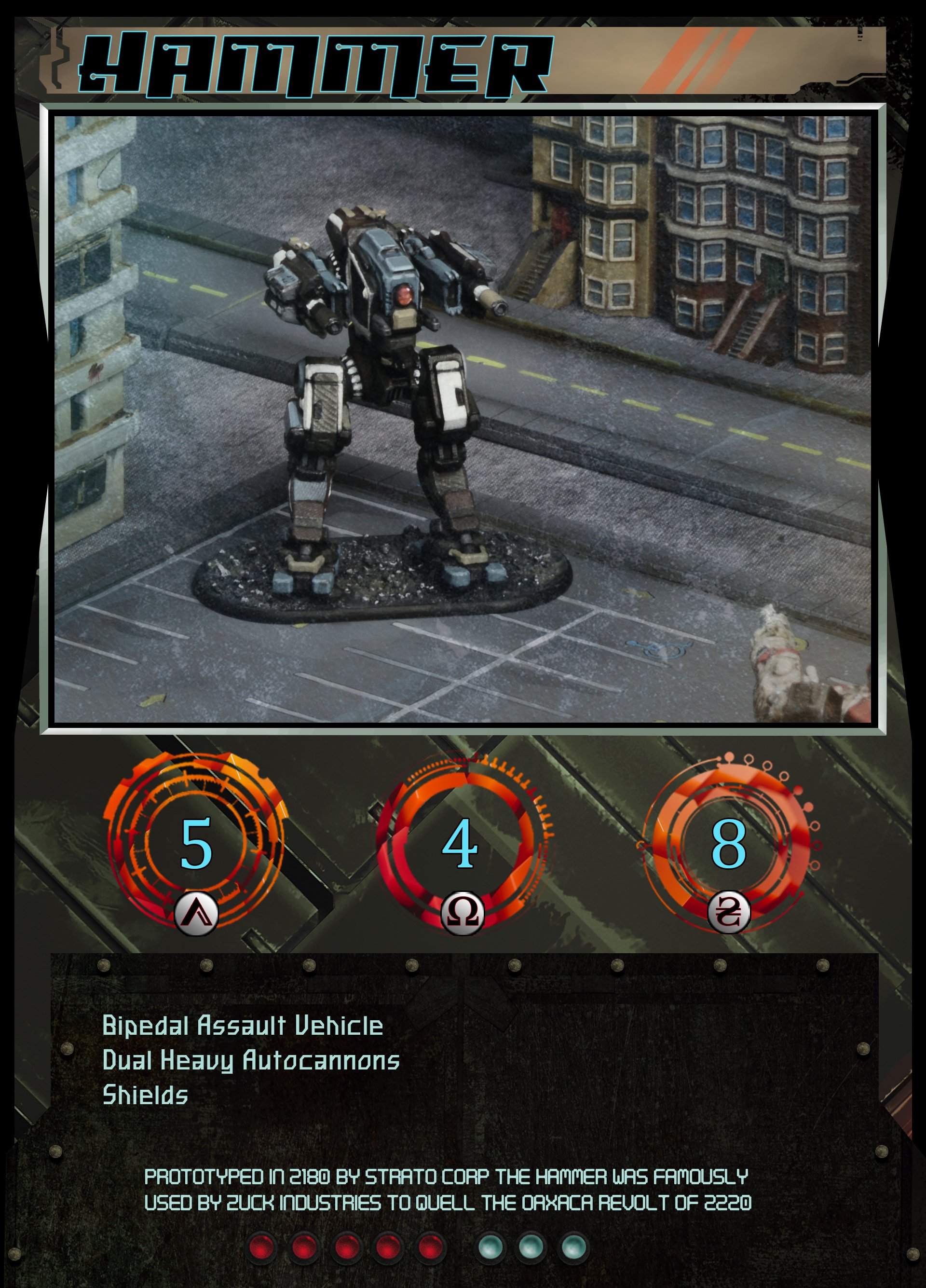
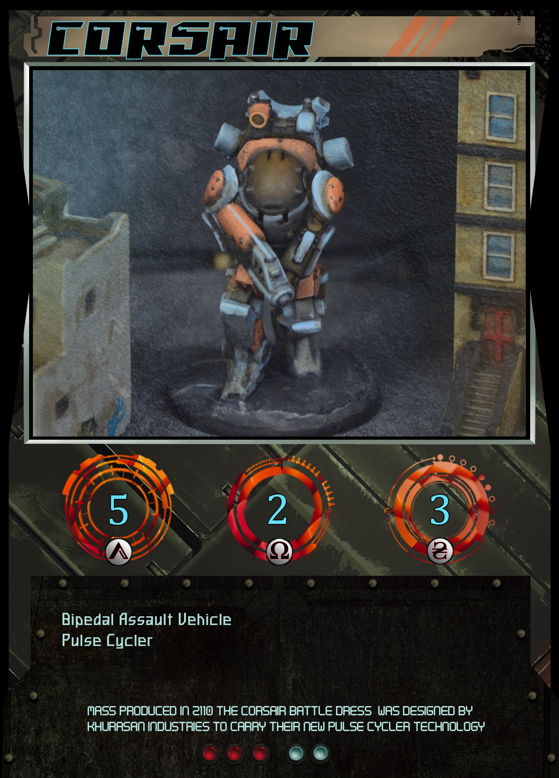
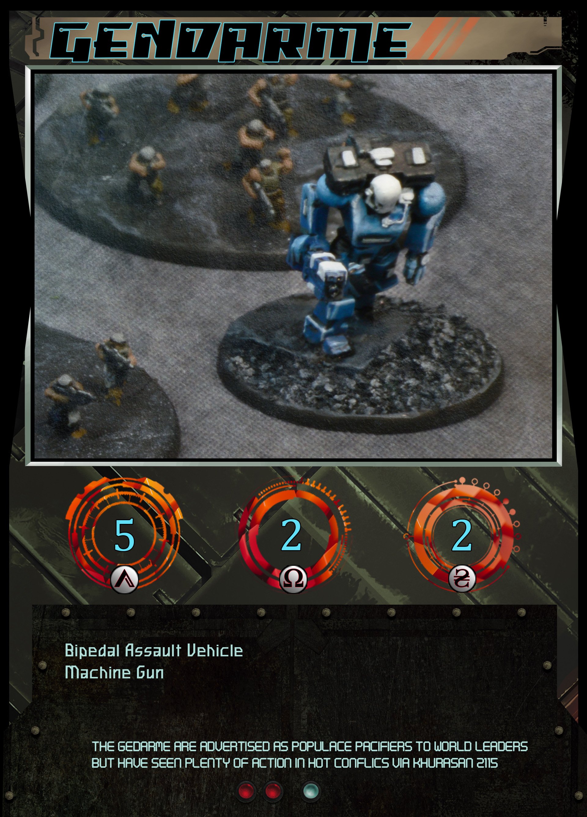
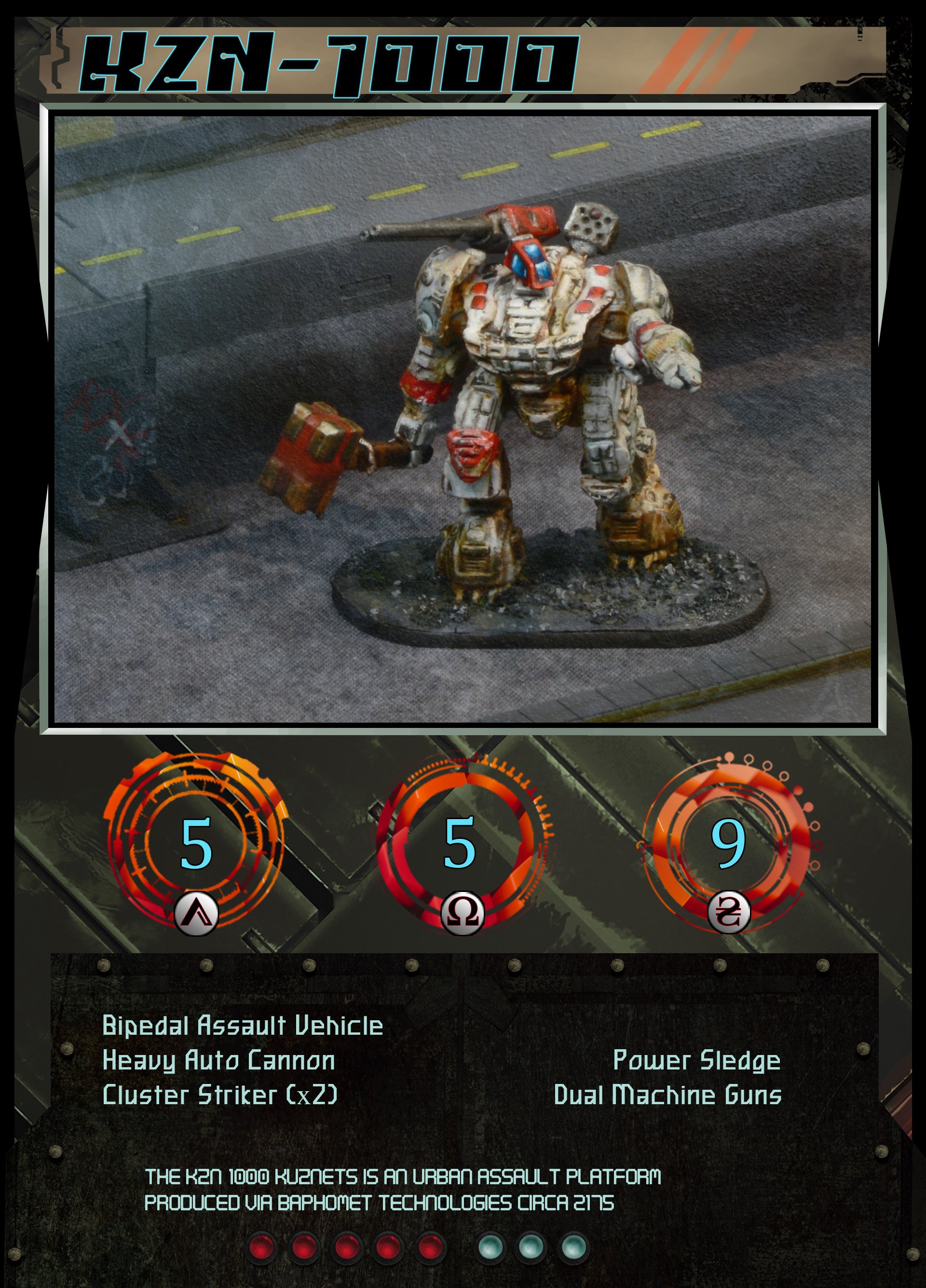
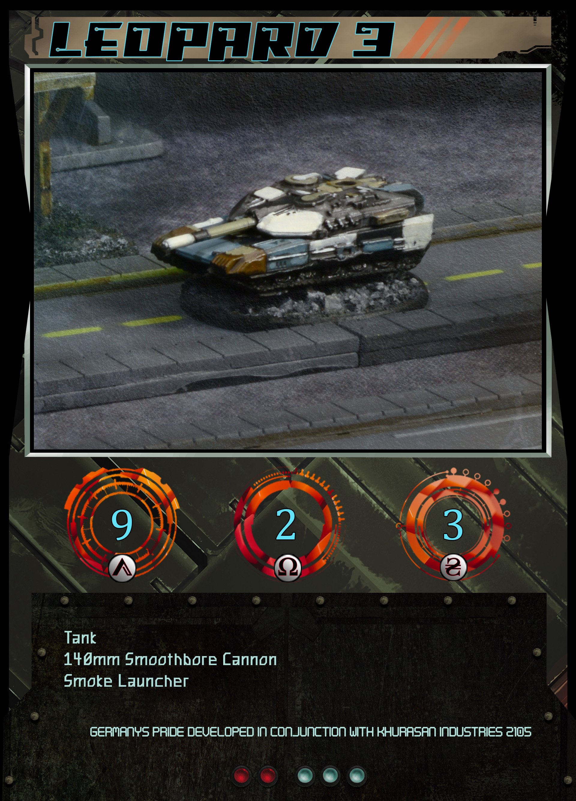
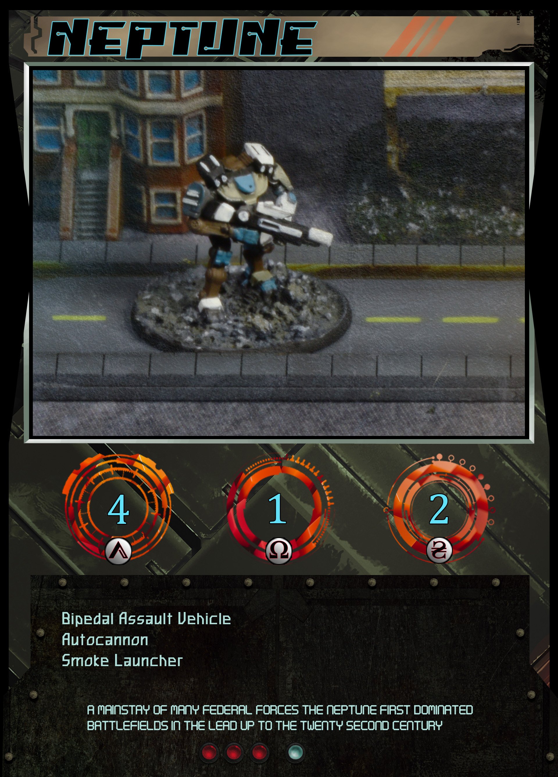
The final version (iteration 13) is a huge improvement over the first in terms of both readability and aesthetic. The PSD file has roughly 40 editable layers organized into 7 folders. I advise spending time properly naming your layers and folders, as this can be a huge time saver if you decide to rearrange things, and also helps to organize your own thoughts in the process.


